It’s kind of amazing to realize that the Gulf Stream (GS) that flows north and east off our coast consists of two distinct but inseparable flows. One is the western boundary flow of the circulation driven by the trade winds at low latitudes and the westerlies at mid-latitudes. We’ll call this horizontal circulation the Gyre. The other flow is the northward transport of warm water in what is known as the Atlantic meridional overturning circulation (AMOC). It is cooled at high latitudes, especially in the Nordic Seas. The Gyre transports 20-25 Sv(erdrups, where 1 Sv = 106 m3s-1), and the AMOC in the 16-18 Sv range where the actual amount depends upon location and time. Being driven by the direct action of winds on the sea surface Gyre transport varies more widely and more rapidly than the more sluggish, thermally driven AMOC.
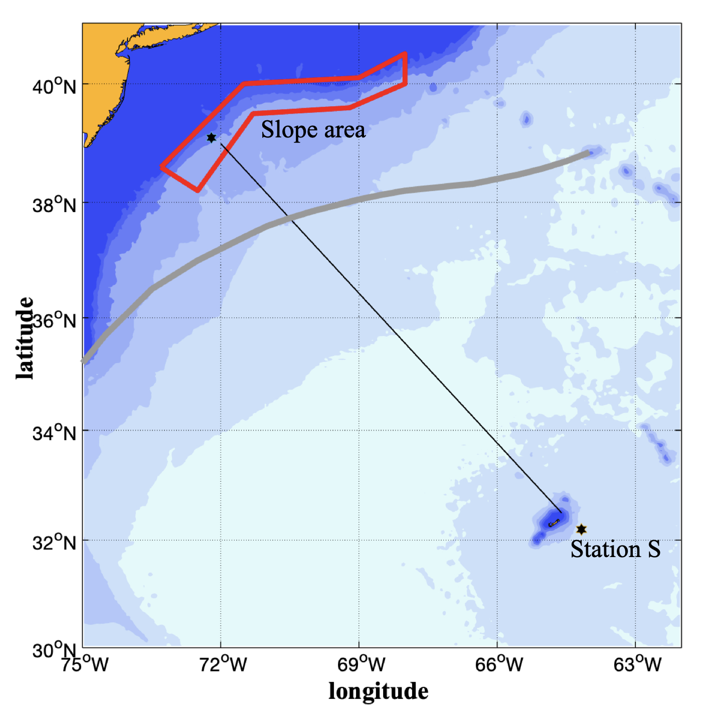
To provide a bit of background the map shows the Bermuda – New Jersey region and the mean path of the Gulf Stream. We have been operating an acoustic Doppler current profiler (ADCP) on the container vessel Oleander since late 1992 along the black line. We also have deeper reaching data from the Explorer of the Seas for the 2006-2010 years.
The previous blog post shows the mean velocity field normal to the line obtained from the Explorer of the Seas. The GS is the striking feature of the section. It is most intense near the surface for two reasons. The wind-driven Gyre is limited to the top kilometer of the water column, and curiously, the northward AMOC transport is also limited to the top 1000 m, below which the AMOC, having been cooled at high latitudes, flows south. We call the depth at which the average velocity across the line changes sign the level of zero transport (LZT). The flow is poleward in the Gulf Stream and equatorward everywhere else. Knowing this depth is quite valuable for it enables us to use earlier archived data to estimate how GS transport may have changed over time (Rossby et al., 2022). Here we show three ways we’ve tried to estimate the LZT. It is an instructive exercise that illustrates the point of the previous blog post – how measuring currents directly from vessels in regular traffic can complement the surface vision of satellites.
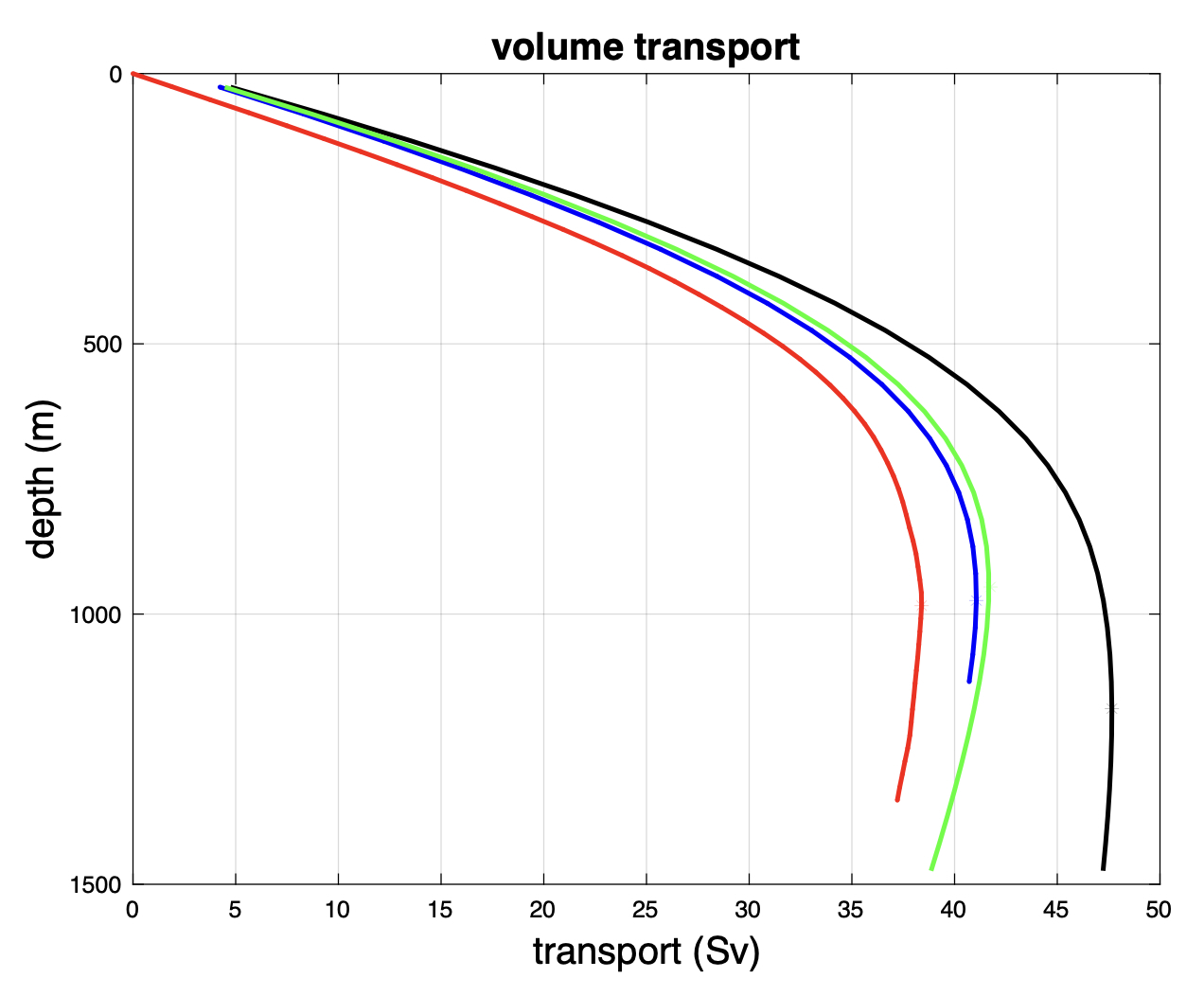
This figure of transport integrals shows the three data sets used to determine the LZT. The red curve shows transport integrated from the velocity field in the previous blog post. It shows a broad transport maximum close to 38 Sv at ~1000 m. This is what we have used in the past, but we weren’t sure how robust this estimate was. So, we considered satellite altimetry. We use mean absolute dynamic topography (ADT) of the sea surface to construct, and reference mean dynamic height profiles, here using hydrographic data from Argo floats in the Slope area (see map) and Station S data at Bermuda. The difference profile is integrated geostrophically to get velocity and transport, the black curve which puts the LZT close to 1200 m depth.
The third approach uses more recent ADCP velocity data from the container vessel Oleander in its weekly service between Bermuda and New Jersey to determine dynamic height difference at 200 m depth, which is below the Ekman layer and most seasonal influence. This is used to link together quality-controlled XBT data at the star in Slope and Station S data to get the mean dynamic height profiles at the northern and southern ends of the section. The difference is integrated geostrophically to get mean velocity and a transport maximum (the LZT) at about 980 m. The red curve includes a roughly 1 Sv Ekman layer transport opposite to the GS which the geostrophic integrals do not see. Adding this to the red curve reduces the difference from the blue curve to about 1 Sv which I consider excellent given the completely different methods and that the red curve data are from the 2006-2010 period whereas the blue curve is based on new ADCP data for the 2023-2026 period. I have more detailed information on this work if you are interested.
In the next post I’ll discuss why black curve differs so and what is required to bring it into alignment with the other two curves (the green curve).
The Explorer of the Seas data were obtained with a deep-reaching 38 kHz ADCP. When the Oleander goes into drydock next time we will install a similar system. We have also learned how to optimize the installation for best data returns. This will give us an unprecedented window into the top 1200-1500 m of the water column. I can’t wait for this to happen!
Rossby, T., J. Palter, and K. Donohue (2022). What can hydrography between the New England Slope, Bermuda and Africa tell us about the strength of the AMOC over the last 90 years? Geophys. Res. Lett., 49, e2022GL099173. https://doi.org/10.1029/2022GL099173.